FontDiscovery 🖼️ 33: You Got Options, Featuring Mega Font Family Cormorant
I'm Hua, a designer and bootstrapping founder building Typogram, a brand design tool. As part of running Typogram, I create this digestible weekly guide with fonts, colors, and design ideas to help founders, creators, and makers step up their game in marketing and get creative!
Hi Community👋
Welcome to issue 33 of FontDiscovery! I hope you had a nice weekend. If you are new, I am so glad you are here!
This weekend, my co-founder Wenting and I did our first ever launch on Product Hunt. If you didn’t know, Product hunt is a website for tech product makers to show the community what we are working on. As product hunt newbies, we had a lot to learn. The launch went well, and we learned a lot in the process, which was the original goal. We are grateful to everyone who supported us. Thank you so much! You can see our launch here and read our learnings here. The adventure continues 👾.
This week, our theme is Strictly Business. We go over a font with a classic vibe, brainstorm about creativity in emojis, and look at IBM Corporate Identity. Let’s dig in!
In this issue
- Theme: Strictly Business
- Font of the Week: Cormorant
- Design Idea: Original Emojis
- Color Inspiration: IBM Corporate Identity
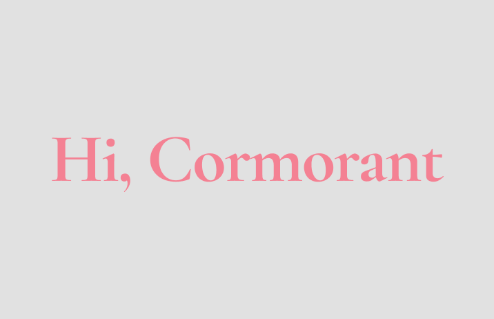
img: sample of Cormorant.
Font of the Week
In a previous article, we introduced EB Garamond. If you like the classic vibes of EB Garamond but want more weights and styles, Cormorant might be the font for you. Cormorant is an old-style serif. An old-style serif has a “diagonal stress,” which means that the thinnest parts of letters are at an angle. The serifs are also bracketed: they are connected to the strokes with curves.
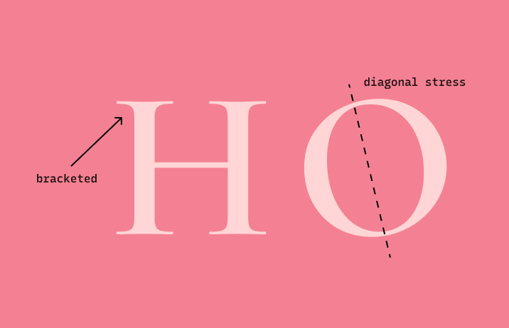
img: graphic showing bracketing and diagonal stress of old-style serif
What I love most about Cormorant is its versatility. Like Plex, it has many variations and depending on your project needs. You can determine which one you want to use. Cormant has three styles: normal (Cormorant Roman), italic (Cormorant Italic), and a straight version of italic (Cormorant Upright). Today, we’ll focus on Cormorant Roman, which has two interesting variations: Cormorant Garamond and Cormorant Infant.
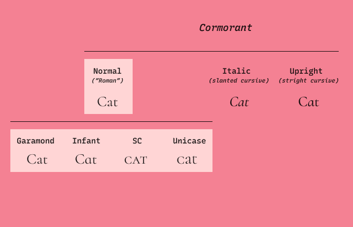
img: chart of the Cormorant font family
Font Details
Cormorant Garamond is convenient for blog sites, e-books, or text-heavy projects because this variation offers large counter spaces to achieve more reading comfort. On the other side, Cormorant Infant is a less grown-up version of Cormorant Garamond; the letters a, g, y are replaced with single-story shapes to make it feel more gentle. If you want a slightly less classic and more friendly tone, Infant can work for you! Other noteworthy variations: Cormorant SC and Cormorant Unicase. Both are small caps, which are great for labels and captions.
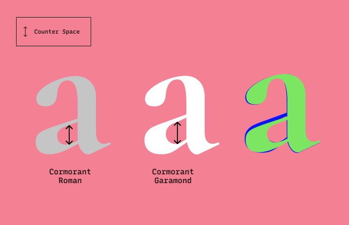
img: graphic showing difference in counter space (spaces like the circular space in the a) between Cormorant Roman and Cormorant Garamond. As you can see, the Garamond has larger counter space. This means that when text is at body size, Cormorant Garamond will be more visible.
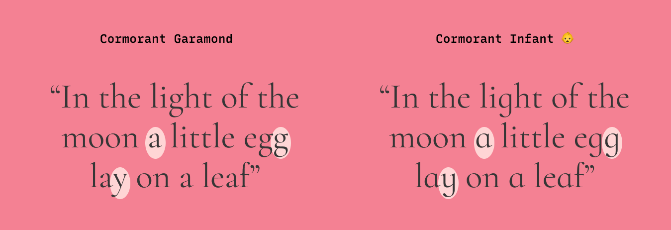
img: double story of letters a, g, y in Cormorant Garamond and single story of the same letters in Cormorant Infant
How to use it for logos?
Cormorant communicates classics and traditions. It’s perfect for brands that are looking for a more classic voice.
How to use it for marketing?
Because Cormorant has many weights, it is perfect for landing pages. Cormorant Garamond is better for readability, so its Regular or Medium weights are better for body copies. The bolder weights have larger contrast and are more suited for large copies in headers and subheads. If you want a slightly more warm tone, give Cormorant Infant a try. Cormorant pairs well with Raleway.
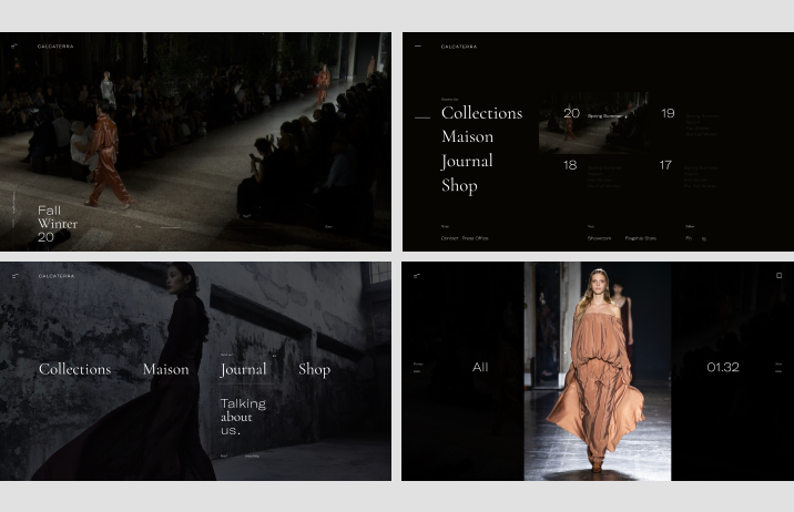
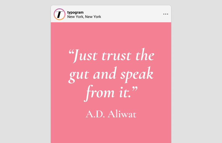
img: Cormorant being used on a fashion website. Source: FontsInUse
Design Idea of the Week
An Original Emoji
"There’s a whole generation of children who ‘learn to read and write’ emoji before they can read and write." Jennifer Lee, the founder of Emojination, a nonprofit advocating for representations in Emojis. (source: Vox )
It is no doubt that emojis are changing the way we communicate with each other. Among the ones we use, the pointy finger emoji is one of the most popular ones on Social media for people sharing their content.
👉 But where does the pointy finger motif come from? Printers made original illustrations, like the pointy finger motif, called printer’s cut back in the day. It was a signal and command for people to read whatever it was pointed to. The pointy finger became a staple in posters, bills, and ads.[1] in the 19th century US.
Creating original emojis, emotes, and reaction gifs as part of your brand can be memorable for your businesses. Streamers are already doing this on Twitch and having successes. Their fans have access to premium emotes and unique gifs.
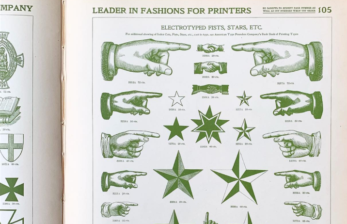
img: printer’s precut illustrations, source: the Arm letterpress
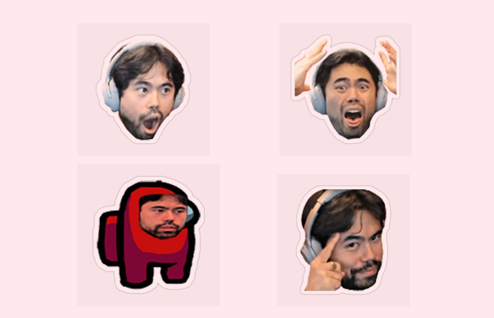
img: Hikaru Nakamura is a popular Twitch Streamer. He uses his face as emotes in his community. Source: GMHikaru
Color Inspirations of the Week
IBM Corporate Identity
This older brand identity is one of the most well-known corporate identities created by Paul Rand, who is sometimes known as the father of graphic design. He convinced businesses that design, especially Corporate Brand Identity (consistent logo and systematic visual assents for companies), was vital to help enterprises communicate their values to the public and create brand awareness.
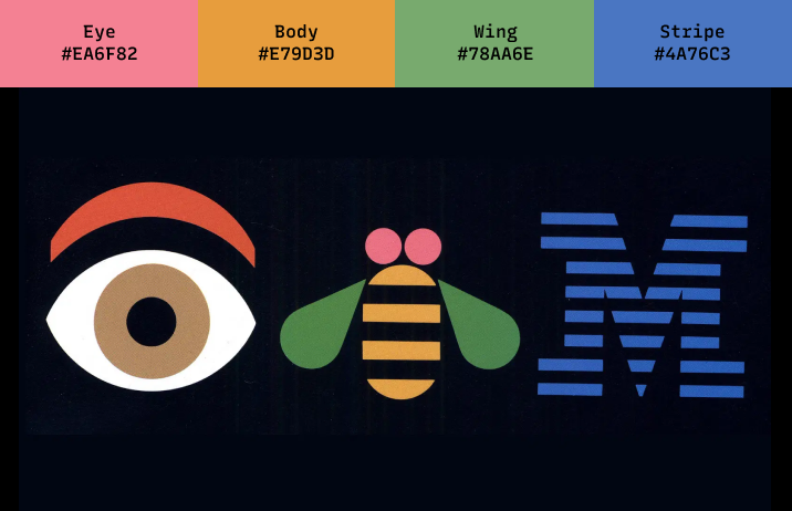
Img: Paul Rand’s initial IBM logo made the public aware of IBM as a brand. source: qz.
🌱 Jargon Buster!
Font Family
A set of fonts that share design styles. For example, Helvetica Bold and Helvetica Regular, both of these are in the Helvetica Family. Another example, Cormorant Roman and Cormorant Italic are in the Cormorant Family.
Creative Prompt
Emoji Time
Create your own emoji or gif! If you need a little technical tutorial, here is a quick video. I would love to see what you create via Twitter or Email!
Thank you!
Thanks for being here for another week. Cormorant is available here. It is designed by Christian Thalmann.
If you enjoy this series, you can subscribe here:
Have more questions about design and fonts?
Please email me [email protected] or find me on Twitter at @HuaTweets.
You can also read the past issues on Typogram's blog.
Additional Sources:
1: Steven Heller, 100 Ideas that Changed Graphic Design
