The UX of images on a landing page in 7 examples
What images should you use for your landing page or blog article? In this article we take a look at images I found on various landing pages and how they could improve.
Read this on my blog for better readability
1. Don’t use weird colours for obvious objects
FamiJam
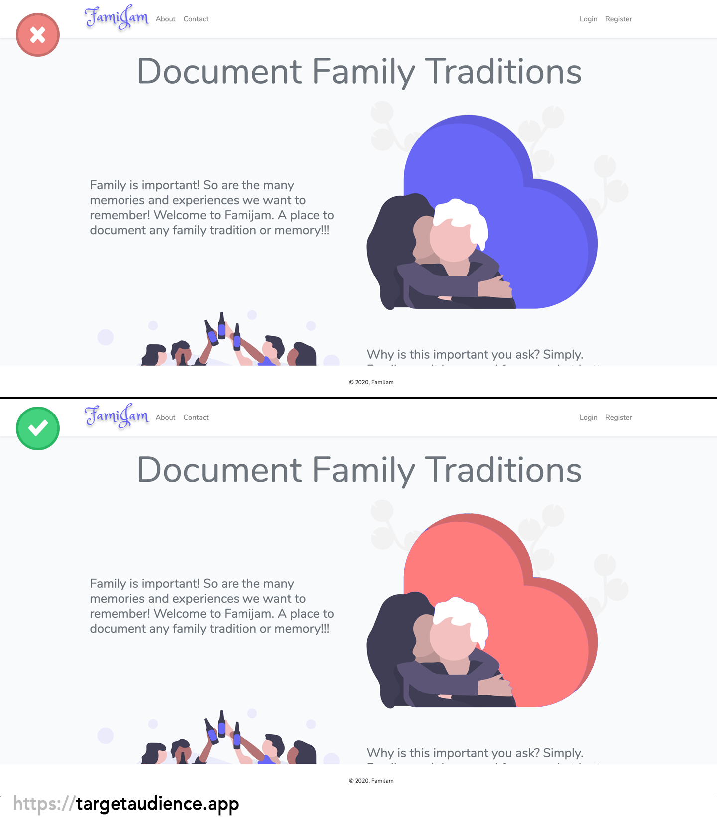
Although it’s obvious that the object behind the two people represents a heart, it’s a bit awkward to see it in purple colour. If you’re talking about a heart most people see a red heart shape in their minds. That’s an image we don’t want to mess with. A purple heart doesn’t radiate love but looks rather toxic!
2. Check where people look at
Minutes
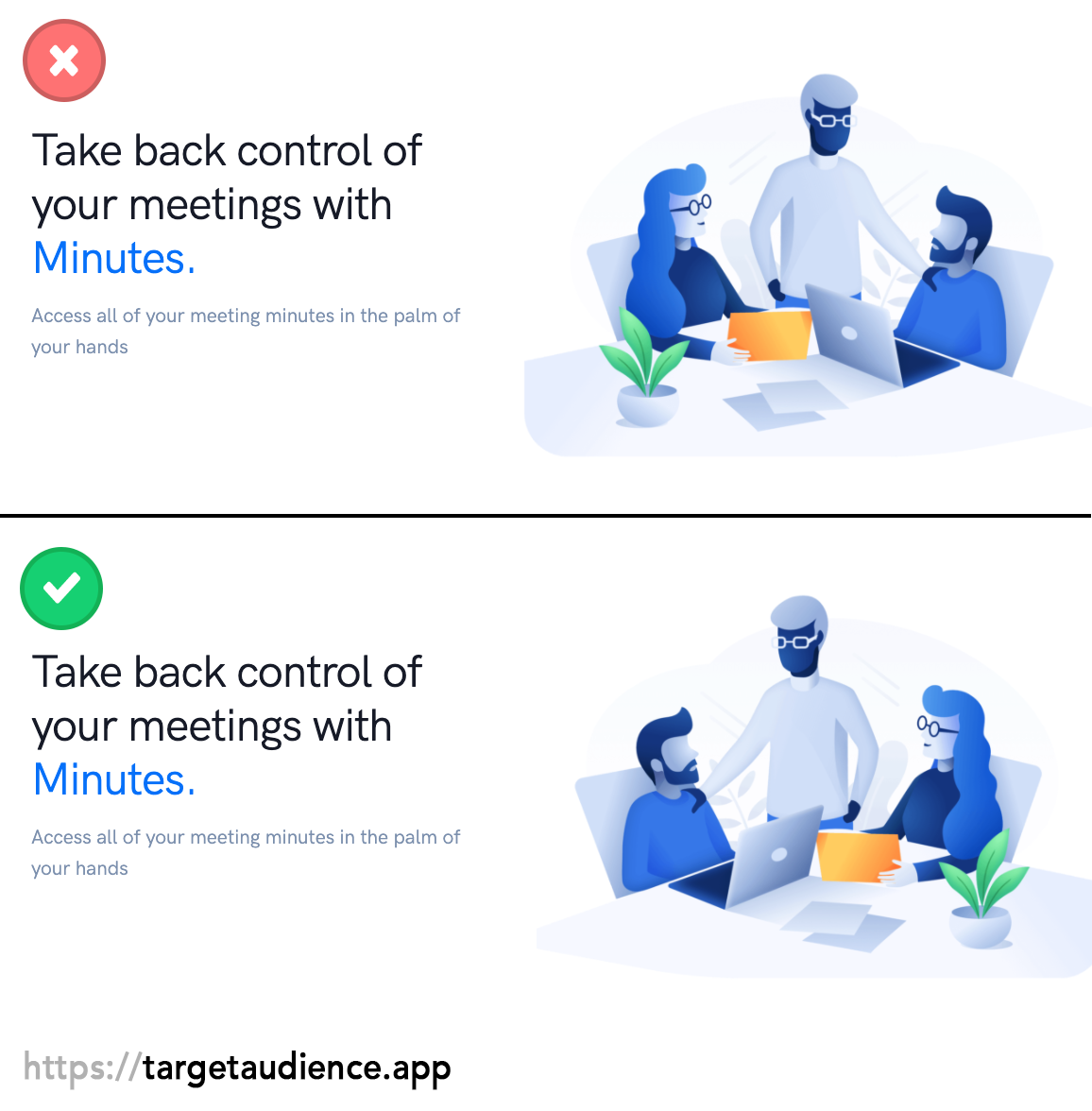
I’ve been looking at this for a long time why I think it should be mirrored. I thought the only reason was that there are 2 people staring to right and only 1 staring to the left. After looking at this image while editing it, I think another big reason is that the 2 people are wearing glasses and the other one not. This makes it look like they have eyes. Images that look towards a paragraph or header will shift your user’s focus to it as well.
3. Or even walk to!
Snap Search
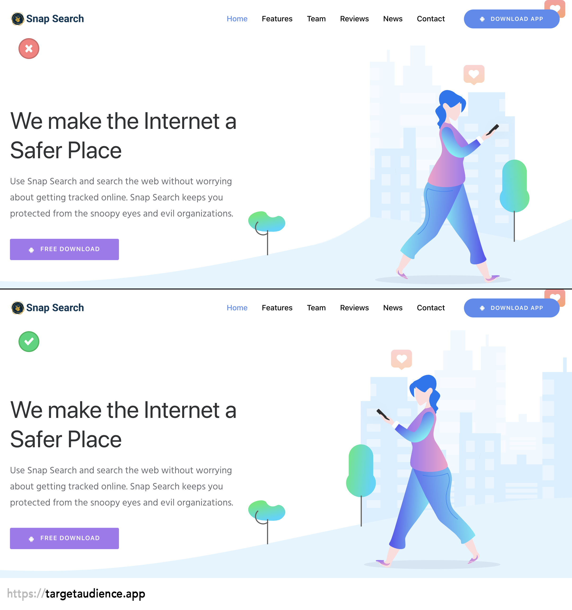
Snap Search understands this principle well! They already had the image looking and walking towards the text. I still wanted to make an example of this, if the woman would walk the other way. What impression would you have if you see someone walking away from your screen? It looks like they are not interested or maybe even bored. And although these are subtle changes you can do in an image, your brains will interpret this differently when the woman is walking toward the text.
4. You associate certain images with feelings
Open Startup List
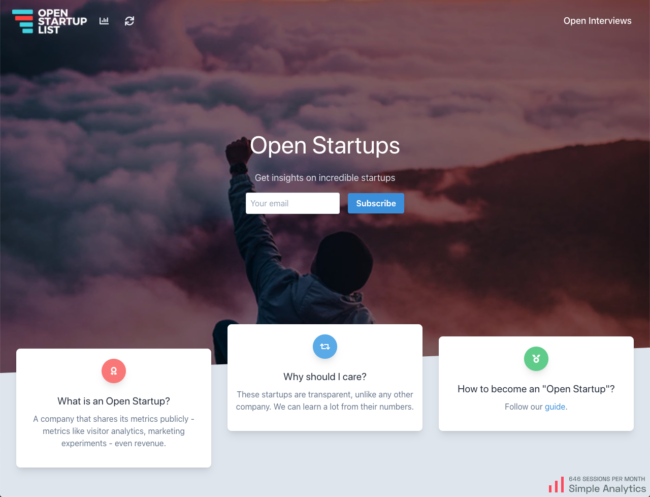
Creating a startup should be an adventure where you are gonna conquer the world. In this case, openstartuplist.com made this clear with an image on top of the world. This is the feeling you want to trigger when your visitors read about other startups as well. A dull image of a startup office is not gonna work here.
5. Don’t try to trigger 5 feelings at the same time
Tagai
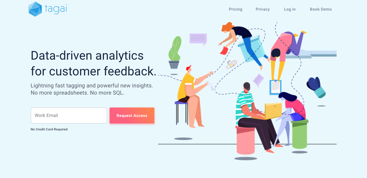
Although images can make your website more alive and bring colour to it, try to keep it simple. This landing page uses such a big image that the focus is more shifted to the image than the actual call to action (CTA). Besides that, it doesn’t add much value to the text.
6. If you do have a heavy image, make it look towards your CTA
Kimp.io
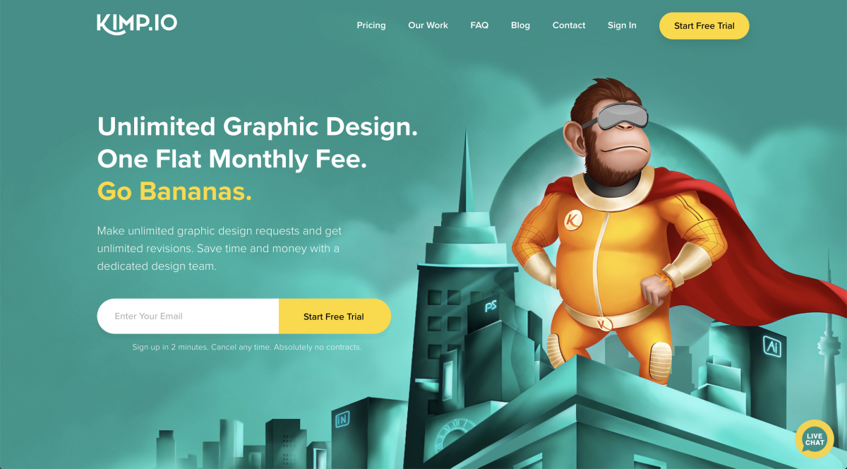
For this website, I think the image is awesome and emphasizes the message. But since it is a big attention seeker it could emphasize the call to action more by making the primate look towards the yellow call to action. A missed chance!
7. But you don’t need eyes to shift focus to a CTA
Wunderbucket
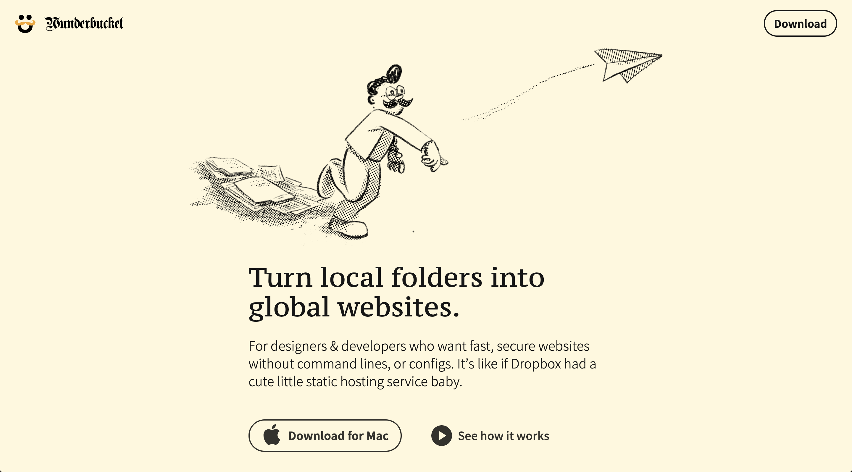
This example is a perfect showcase of how you shift your visitor’s attention to a call to action!
I hope this inspires you to take a look at the images on your own website and check if you use them correctly!
It took me quite some time to collect all the content. If you liked this, please show some love to this Twitter thread.





Threads like these make me wish IH had a bookmarking feature.
I totally agree.
I second this.
I take that as a compliment, thank you!
Heel waardevol :thumbsup:
Dankje Rob!😄
I hope you guys don't mind that I used your website as an example😅 @paolo @jorgevmendoza @cybersky @nscode @mgava @Vvelnaya @levinunnink
It's more like an honour. Thank you 😅
Hey that's great, thanks for the mention and the advice
I don't mind at all. Thank you! :-)
Though I think it would be nice if you could at least link to the original landing page in the description. 🙂
You're right. I added all the links under the headers :)
This comment was deleted 4 years ago.